Discovery
User Testing
UX/UI Design
Design System
Client
Lunch Is Served | Willdom
Location
San Francisco, CA
Team
Design Lead (my role)
Tools
Figma, Dovetail, Protopie
Improved UX → More Sales
By making the ordering process more convenient, Choicelunch aimed to sell more lunches to the schools they were already serving, avoiding additional logistical costs.
Overview
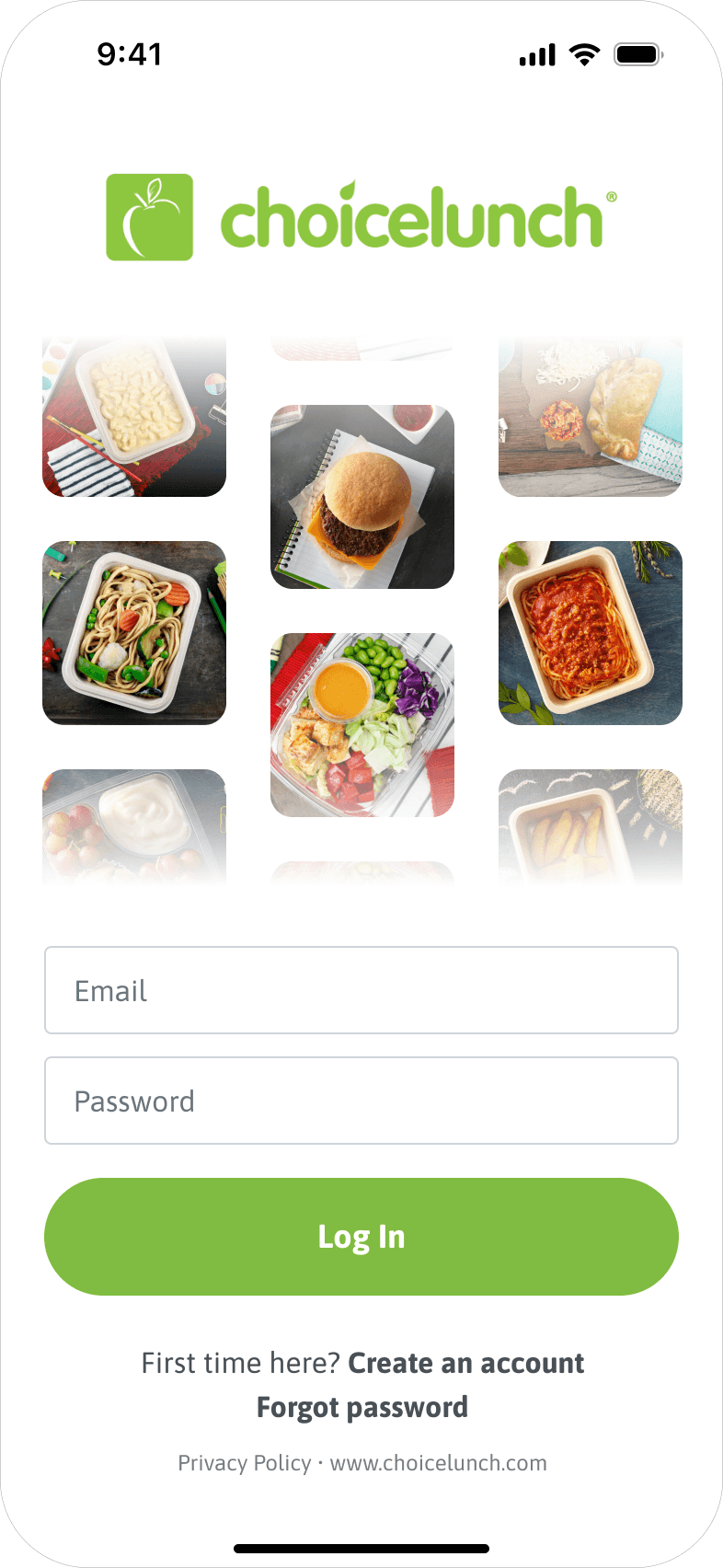
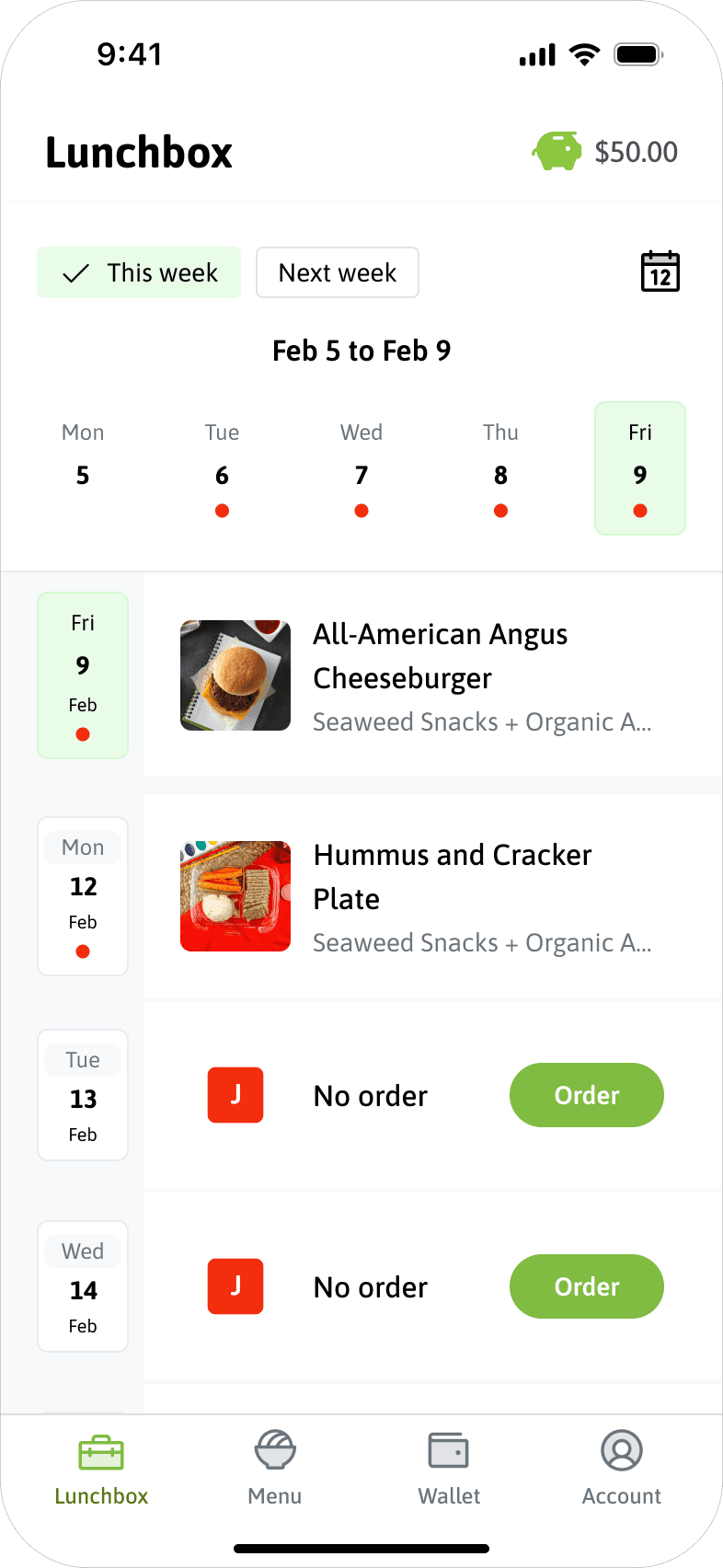
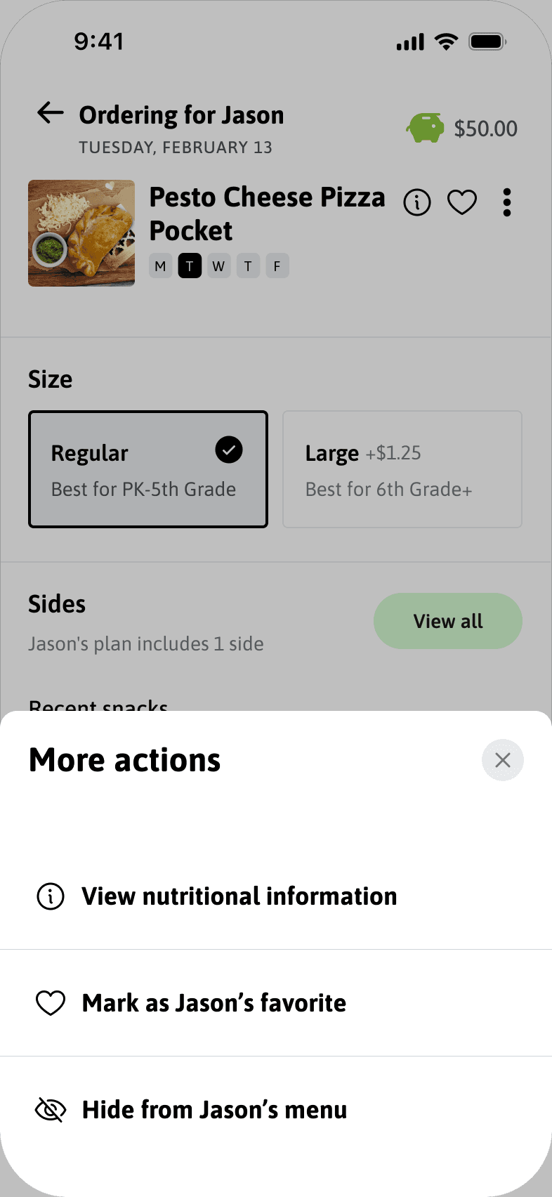
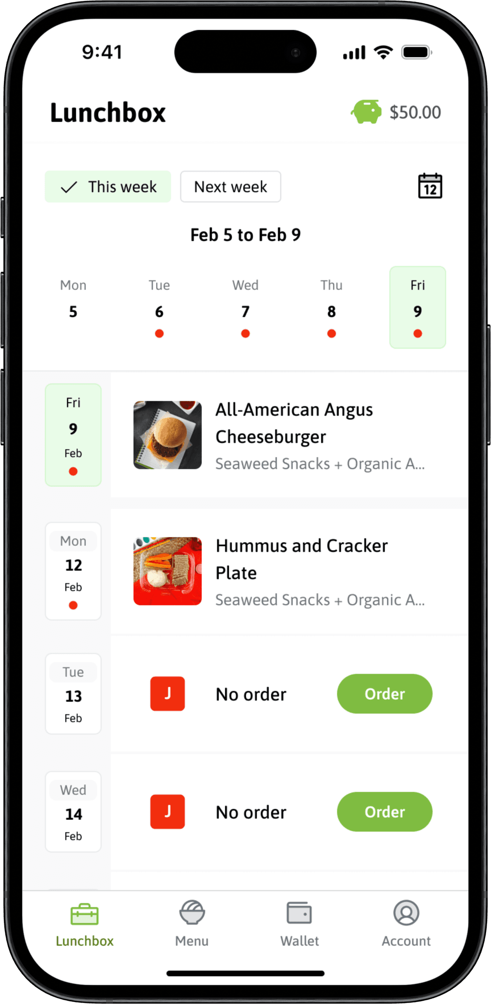
Choicelunch is an app that allows parents to select their children’s lunches at schools across California. The primary goal of the project was to redesign the app to improve usability and customer satisfaction, ultimately to increase sales.
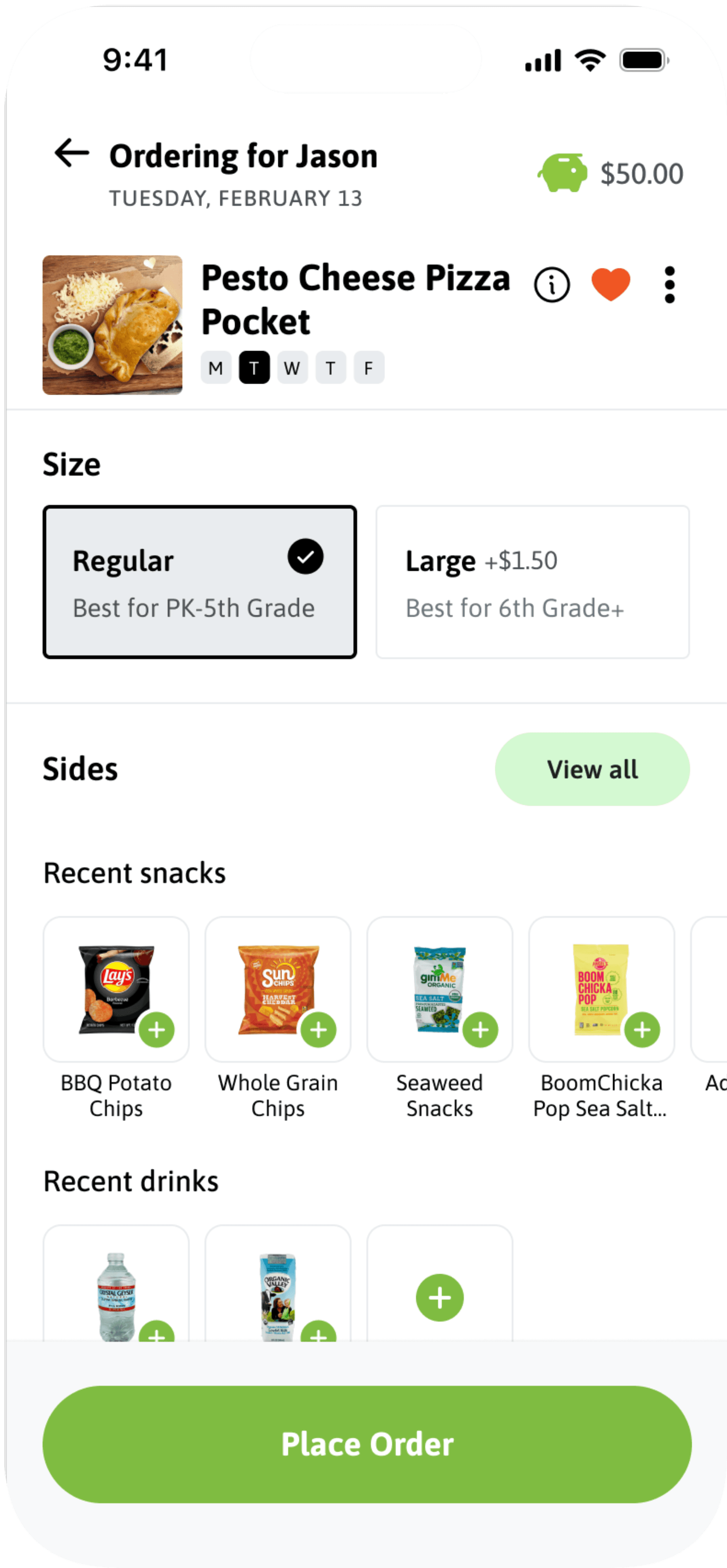
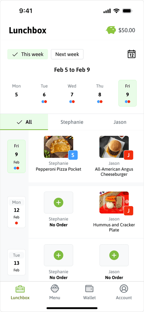
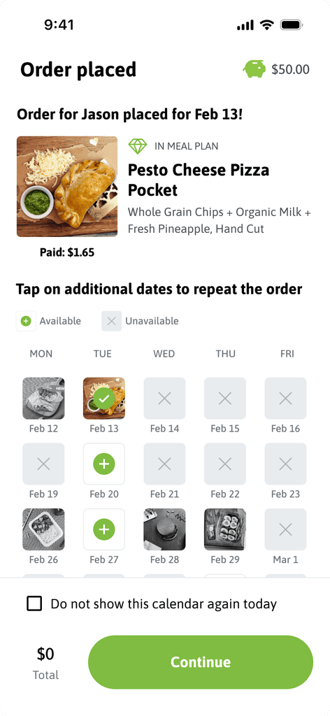
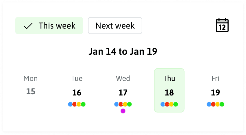
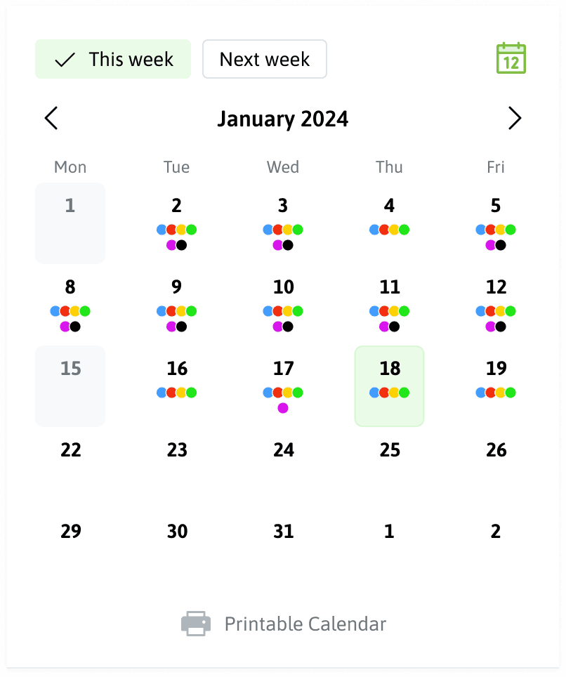
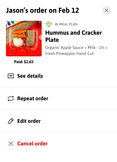
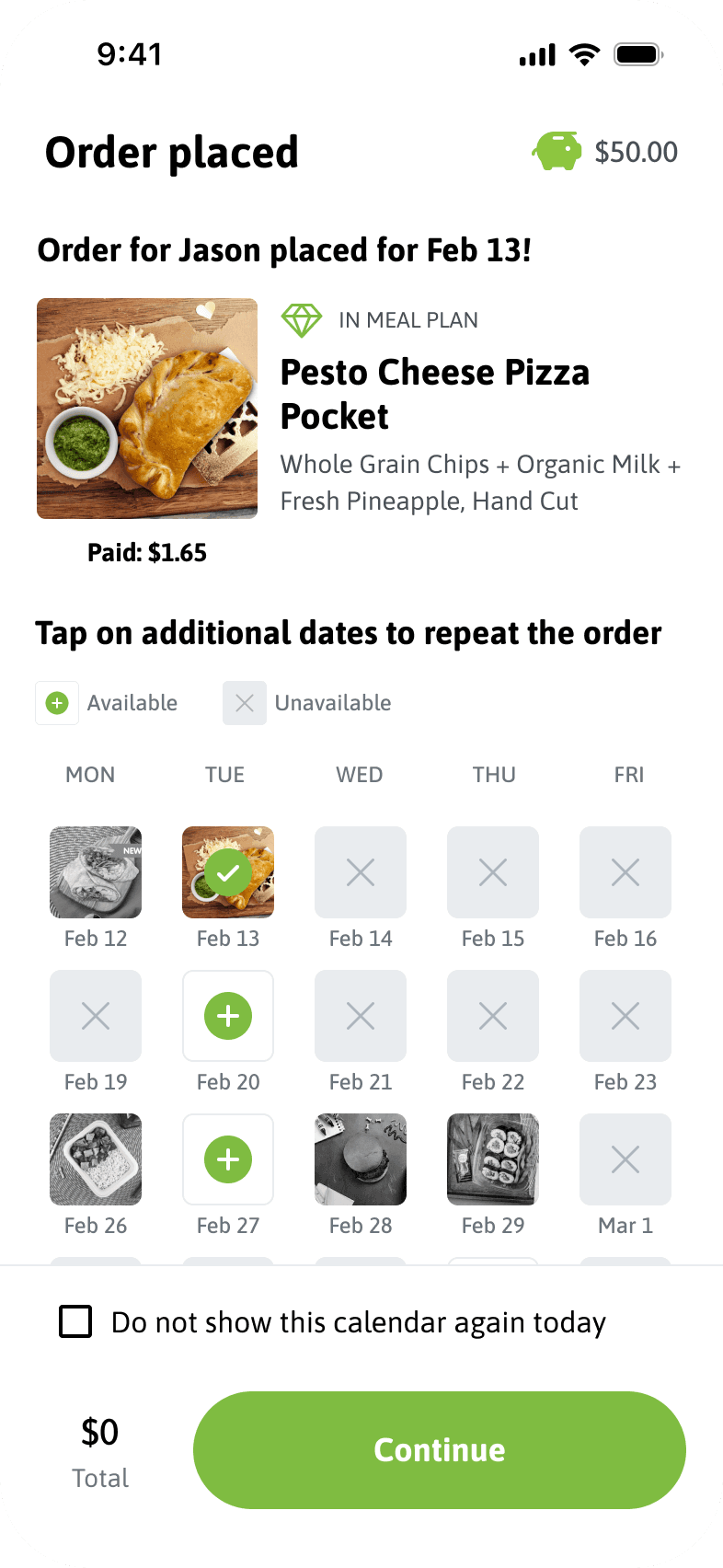
The new design introduces features like multi-date ordering and repeat previous orders, making the app more intuitive and faster.
Key Metrics
Tracking these metrics will be essential for evaluating the app’s performance with the upcoming launch:
Time to Order: The average time it takes for parents to place a lunch order.
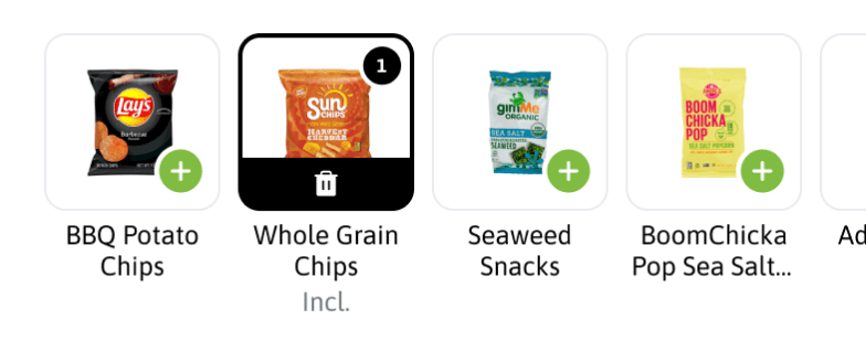
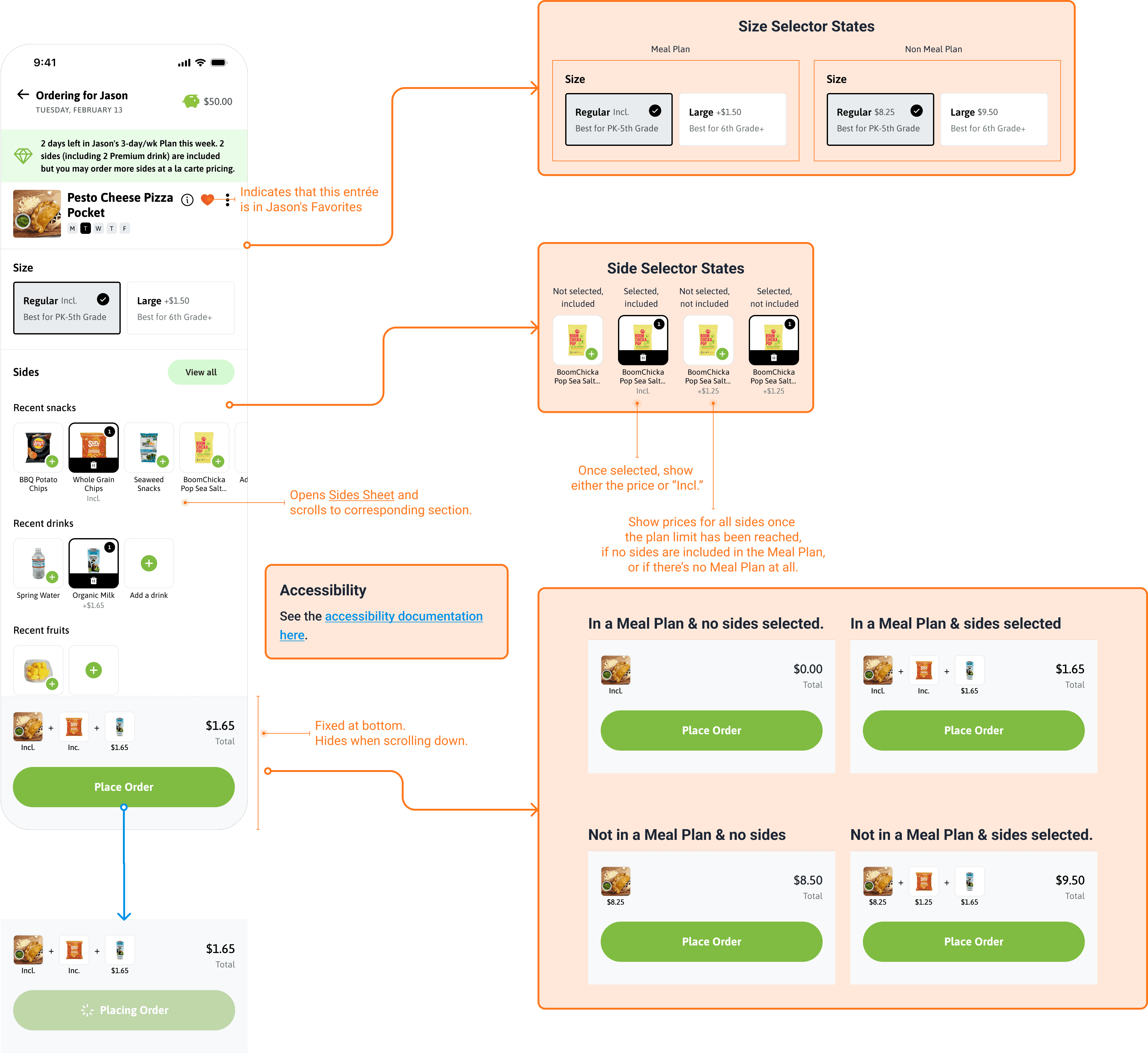
Sides per Lunch: The average number of sides (snacks, drinks, or fruits) added to each lunch order.
Orders per Session: The number of lunches ordered by parents in a single session.
Meal Plan Enrollment: The percentage of kids enrolled in meal plans, which include a fixed number of lunches and sides per month.
Note: The app is yet to be launched. Precise metrics are omitted in this case study to avoid disclosing confidential business information.
The Challenge
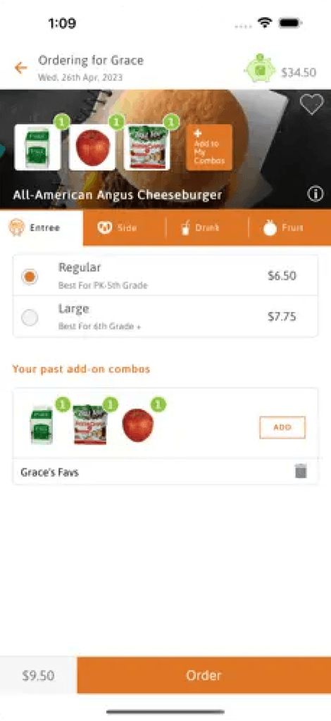
The old app was outdated and faced several significant issues:
Time-Consuming Ordering: The process of ordering lunches was lengthy and frustrating for parents.
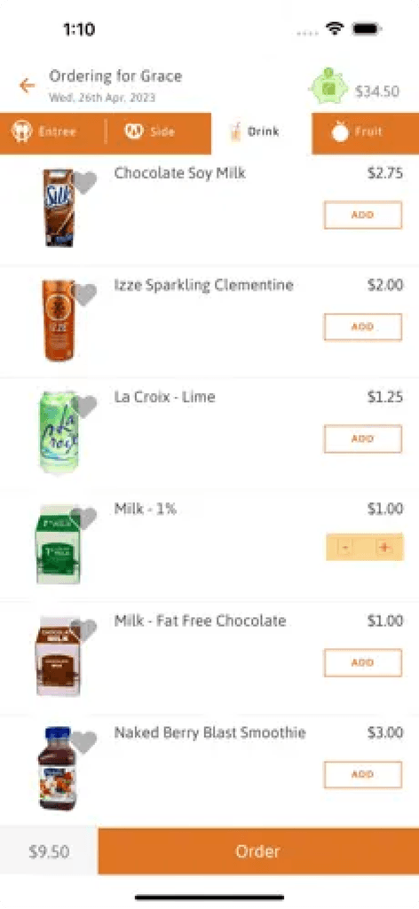
Difficult Mobile Use: Despite the convenience of mobile devices, many parents preferred the desktop version due to challenges with the mobile interface.
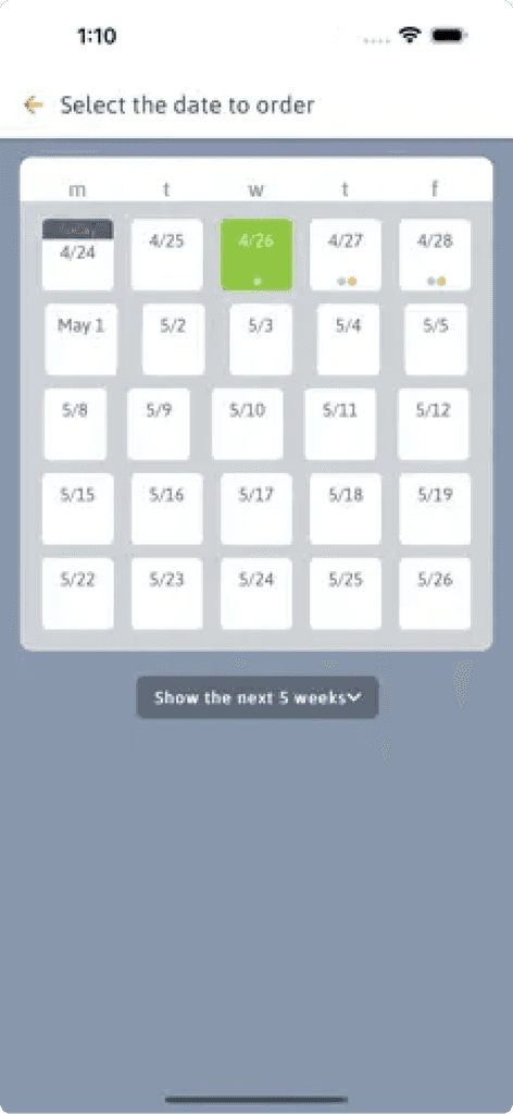
Limited Planning: Parents typically planned their kids’ meals one week at a time. The hypothesis was that a more efficient ordering process would encourage planning several weeks ahead.
Meal Plan Enrollment: There was potential for growth in meal plan enrollments, indicating room for improvement in the user experience.
The Process
To tackle these issues, we implemented the following approach:
Leveraging Previous Research: We reviewed and synthesized existing research to gain valuable insights into user needs and pain points.
Asynchronous Design Sprint: Conducted an asynchronous design sprint with the Choicelunch team to align on the product vision and develop initial solutions.
Prototyping and User Testing: Developed high-fidelity prototypes and conducted user testing sessions to gather feedback.
Iterative Refinement: Based on feedback from users and the Choicelunch team, we made iterative improvements to ensure the design met user needs and business goals.
Detailed Design & Design System: With validated ideas, we moved on to the detailed design phase, creating a design system to ensure consistency.
Outcome
© 2024 Alberto Samaniego

